- Q1. In what ways does your media product use, develop or challenge forms and conventions of real media products?
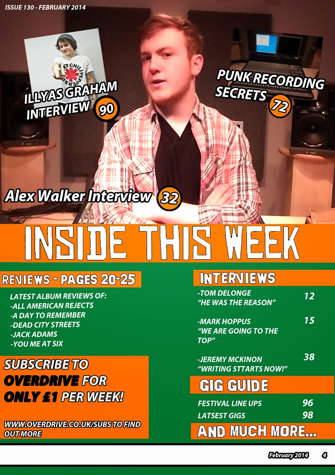


My final products show continuity between them which is conventional with most magazines. This is shown by using the same cholour scheme, They all have similair font styles, and they all show the same stories/model in the pictures used to show they all belong to eachother and it is one magazine. Some other conventions my magazine uses are; a foooter on the cover, to give the reader an idea on what they can expect to read about and it also gives an idea on what the magazine is about, on the contents page, I have used a subscription box that promotes a cheaper price and gives information on where to go, this is to make user the magazine definitely has an audience and it makes the reader think they are getting it a lot cheaper, making them feel special if they subscribe, on the double page spread, I have used two columns of text and have a pull quote in the middle of them both, this is to make the reader interested in what the musician has to say and it makes them want to read the article, if they like the article they will want to buy the magazine again and will also recommend it to their friends, building a wider audience.


I tried to take elements from existing front covers to make my magazine look professional. I tried to take inspiration for the main article from the NME cover because iIliked the style and I thought it could be used in other genres other than indie. I used the idea of bands in the header from Kerrang! but I made it into a footer because I wanted to put something else as the header. I also made my mast head look similair to the Kerrang! mast head becasue i thought it was a good design and looked good in my genre of magazine. I used the style of how the main text was shown on the rock sound cover because I liked the background with a bit of opacity so oyu could see the band underneath.


I took elements form both, NME and Kerrang! because I thought that both together they would look good. I used the idea of having the main story picture in the top half of the contents page with stories ontop of the mian picture from Kerrang! because I thought it looked really good and it worked well. I also took the idea of having a subscription box from this because I thought it looked really good but mine wasn't quite the same looking becsause I couldn't get images to use on the subscription box. I used the idea of having categories to show the different stories because I liked how it seperated all the different stories and it makes the categories stand out.


I used the idea of having the picture in one half of the page and and the text on the otherside form the NME double page spread because I think its looks really nice when the text and the article are seperated. I also used the idea of having text above the article from the NME double page spread because thought it looked good and it let the reader have a quick insight of what the article is about. I used the idea of having different coloured text throughout the article form NME because it made things stand out a lot and drew me to that part. I took the idea of having a drop cap from the Rock Sound magazine because it looked really professional.
I tried to take elements from existing front covers to make my magazine look professional. I tried to take inspiration for the main article from the NME cover because iIliked the style and I thought it could be used in other genres other than indie. I used the idea of bands in the header from Kerrang! but I made it into a footer because I wanted to put something else as the header. I also made my mast head look similair to the Kerrang! mast head becasue i thought it was a good design and looked good in my genre of magazine. I used the style of how the main text was shown on the rock sound cover because I liked the background with a bit of opacity so oyu could see the band underneath.

I used the idea of having the picture in one half of the page and and the text on the otherside form the NME double page spread because I think its looks really nice when the text and the article are seperated. I also used the idea of having text above the article from the NME double page spread because thought it looked good and it let the reader have a quick insight of what the article is about. I used the idea of having different coloured text throughout the article form NME because it made things stand out a lot and drew me to that part. I took the idea of having a drop cap from the Rock Sound magazine because it looked really professional.
- Q2. How does your media product represent particular social groups?
- Q3. What kind of media institution might distribute your media product and why?
- Q4. Who would be the audience for your media product?
My magazine was initially targeted at men aged 16-25 because the music produced is typically produced by males and the music is often quite aggressive which is not what you expect a woman to like. It is targeted at males aged 16-25 because they are the main consumers of music and they are often the most interested by music so they will be the most likely to buy a music magazine. A lot of the musicians featured in the magazine all started out making music at around the same age as the readers meaning they could connect with each other. When I first started the task I made an audience pack based on existing audience packs that are related to my genre of music so I could show the exact type of person that I would like to produce my magazine for.
I sent out a survey using survey monkey to get some feedback from some people of my target audience, I asked them;
Question 1. What genre do you think my magazine represents?

Question 2. What type of audience would you say the magazine is aimed at?

Question 3. What do you think is eye catching about the magazine cover?

Question 4. If you could change something on my magazine what would it be?
Question 5. Does my house style match throughout all 3 of my product and How?

Question 6. How would you rate my magazine? 10 being the best, 1 being the worst.

Response 2 by joewilson1997 on GoAnimateI sent out a survey using survey monkey to get some feedback from some people of my target audience, I asked them;
Question 1. What genre do you think my magazine represents?
Question 2. What type of audience would you say the magazine is aimed at?
Question 3. What do you think is eye catching about the magazine cover?
Question 4. If you could change something on my magazine what would it be?
Question 5. Does my house style match throughout all 3 of my product and How?
Question 6. How would you rate my magazine? 10 being the best, 1 being the worst.
Response 1
Response 2


- Q5. how did you attract/address your audience?
The things that will attract the audience the most is what is featured in the magazine. Some things that will attract and address an audience would be interviews, reviews, etc. In the video below I have explained some of the things I have shown in my contents page and I have said why I used them. I also said how they will attract/address the audience.
The reason I made the video based around my contents page was because that is what applies to the content featured the most and that has the most information on what will be inside the magazine.
On my cover, there is a male that looks quite rough and dress quite practical because the people in this genre tend not to care about how they are seen by others and would rather look comfortable. This opens the market up to males and females because it is showing that the people that read can also dress like they are comfortable and dont have to care about how they look. Some women can relate to this because they often want to dress to impress but this shows they dont have to.
- Q6. What have you learnt about technologies from the process of constructing this product?
To make my product I used a lot of different technologies. These were;
Pen drives - As a storage device for all my work because the shared are only allowed us 1GB of storage and much more was needed.
DSLR camera - I used a DSLR Lumix G2 to take the pictures that I used I my magazine because it takes really high resolution pictures I need to use on my products.
Specs of camera

Mac/windows - Both Mac and Windows computers were used while making m product due to there onl being a limited amount of each, so I just used what I could. This is good though because I got used to the different user interfaces.
Photoshop - Photoshop was the main technology I used when constructing my product because it has a lot of tools that are needed to make my magazine look ow it does, such as text stroking, removing the background of images and making people look better by removing things such as spots.
Editing images
When editing my images I used photoshop. I used photoshop to do multiple things to my images. Below i have done step by step, how I edited some of my pictures that could have been used on my final products. Photoshop is good because it has a lot of features that most types of image editing software does not offer or does not work as well, such as, the magic wand tool.
Changing the background of an image


Text stroke


Adjustments


Spot clearance


Pen drives - As a storage device for all my work because the shared are only allowed us 1GB of storage and much more was needed.
DSLR camera - I used a DSLR Lumix G2 to take the pictures that I used I my magazine because it takes really high resolution pictures I need to use on my products.
Specs of camera
Mac/windows - Both Mac and Windows computers were used while making m product due to there onl being a limited amount of each, so I just used what I could. This is good though because I got used to the different user interfaces.
Photoshop - Photoshop was the main technology I used when constructing my product because it has a lot of tools that are needed to make my magazine look ow it does, such as text stroking, removing the background of images and making people look better by removing things such as spots.
Editing images
When editing my images I used photoshop. I used photoshop to do multiple things to my images. Below i have done step by step, how I edited some of my pictures that could have been used on my final products. Photoshop is good because it has a lot of features that most types of image editing software does not offer or does not work as well, such as, the magic wand tool.
Changing the background of an image
Text stroke
Adjustments
Spot clearance
- Q7. Looking back at your preliminary task, what do you feel you have learnt in the progression from it to the full product?

College Magazine

Music magazine
Since the beginning of the year, the most important thing I have learnt is how to use technologies, such as Photoshop, which were used to make my work much more detailed and it gave me more options on how to design my magazine. I also found out other websites to get better text such as Dafont.com which gave me access to much more text ideas. I also feel that since the beginning of the year i have learnt more about the conventions of a magazine, such as a skyline, a plug and pull quotes. The main reason we did the preliminary task was to get to used with the types of technology we would be using to design our product and to also show us how hard it is to get a product to look professional. In my music magazine cover you can see I use a lot of conventions, such as a skyline, a footer, a mast head, a plug and a pull quote. It also use techniques such as text stroking and I have used other websites to get more professional looking fonts. Whereas in my college magazine, you can see I added a footer, a plug and a pull quote and they are the main conventions I used. Also, the colours i used in my college magazine didn't work well together whereas the colours in my music magazine compliment each other well.
If I could change my college magazine cover I would go back to change my text styles, so it loks more professional and it doesn't look so basic, I would go back and change the colour scheme so the text can stand out more and some of the text will not be hidden by colours clashing, and I would have taken better pictures because the picture I used wasn't in a good location with very good lighting and I would have used more props to show the music side of the magazine.
Conventions I never used in my college magazine
- Sky line
- Date, issue number and price
- Main cover line
What I have learnt in photoshop
- Add stroke to text


- How to clear or change a background


- Clearing spots or other marks on model


- Understanding layers
No comments:
Post a Comment